The first Lettering Crit session was just over-the-top amazing. I enjoyed it so much that I just want to do this exclusively from now on! Just kidding #notkidding. If you missed it, here's a replay.
This was a collective work. In the session, it was not only me giving comments and feedback on the work, but all attendees participated (that chat was on fire!). I have to say that it wasn't easy to select among hundreds of submissions and so many great pieces of work, but finally, the projects of Ailen Kenny, Caroline Esteves, Darshita Agarwal, Jenn Rothschild, Irene Clua, and Jenny Mercer were selected. They were the lucky ones to receive valuable feedback for their next iterations.
These are some of the main take-aways of the session, good lettering tips:
1. Composition hints: To get your composition right use the North (N), South (S), West (W), East (E) principle. So if the north of your composition is very busy (with swashes or flourishes), find ways to compensate that in the south portion of your composition.
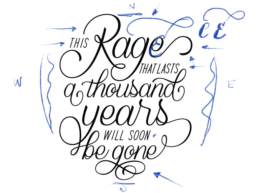
Beautiful script lettering by Ailen Kenny. We suggested a change of shape for letter e.
2. Decorative elements to the rescue: if you happen to have negative spaces (white spaces) within your composition, decorative elements may come handy. Use lines, swirls and flourishes to "cover" those up.
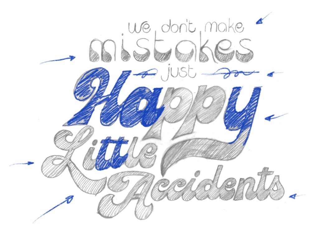
Extreme contrast for Caroline Esteves's work. Perhaps adding some decorative elements to cover up negative space?
3. Watch out with your S: Raise your hand if you ever struggled with an S. Well, I have! 🙋🏻♀️ When drawing an S, focus on the space around rather than in the shape itself. If there's too much space on any of the sides, you might need to adjust the slant or shape of that S.
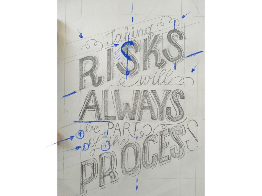
Helping Darshita Agarwal with that S.
4. Use capital letters and design them all together: if possible, use as many capital letters as possible. Capital letters are normally more expressive and wild, and they will add tons of flavor to your piece. Also, when having multiple on your composition, design them all together, so that they share the same features and have the same complexity.
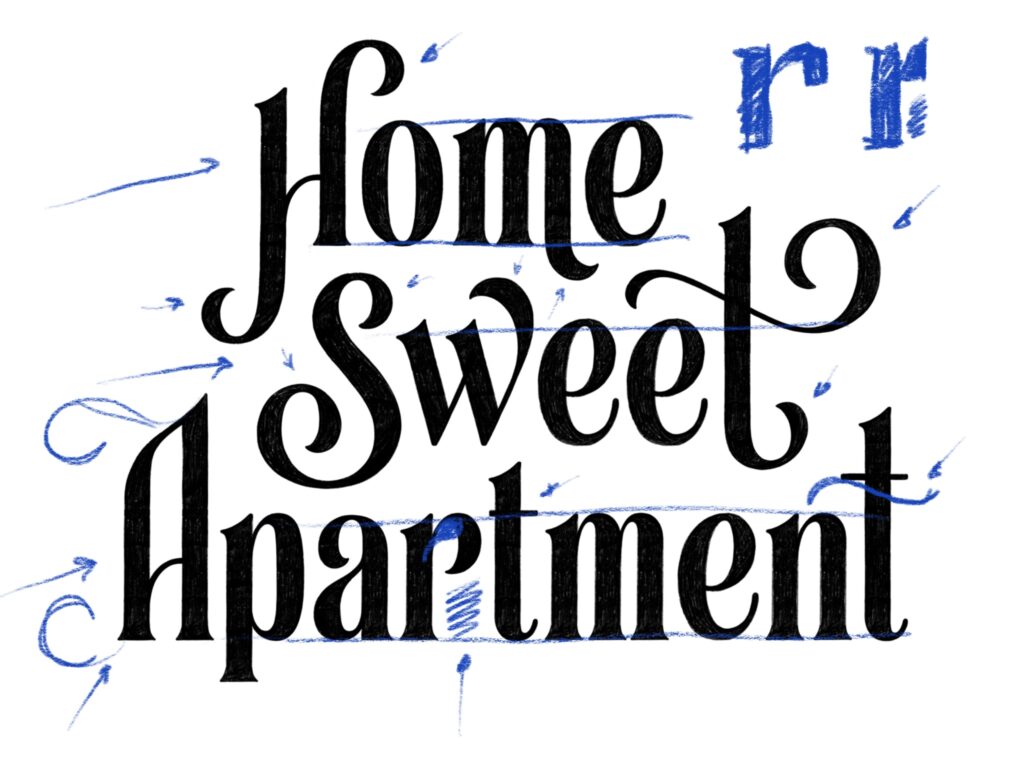
Solid work by Jenn Rotschild. We suggested some flare for her capital letter A.
5. Confirm that is readable: especially when working on flourished compositions, there's the risk of compromising readability. Double-check with other readers if necessary.
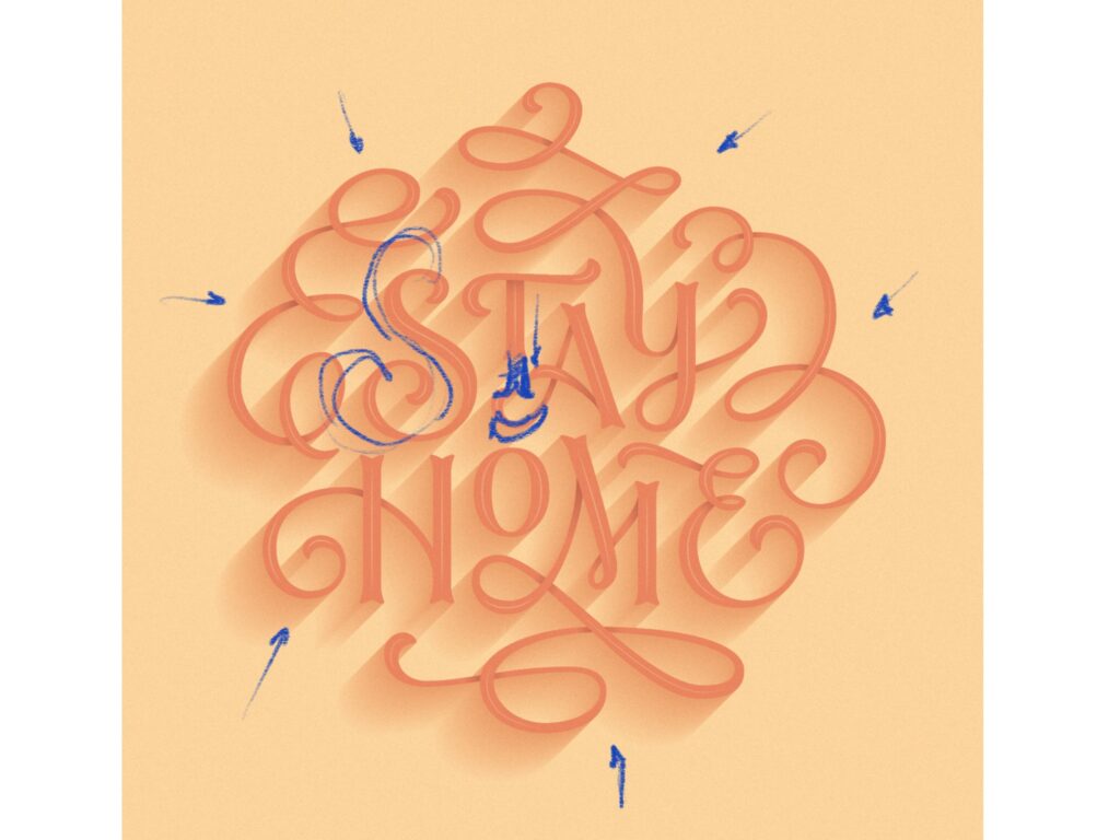
Irene Clua with a beautiful executed piece. It was mentioned that one of the flourishes mike read like a capital E.
6. Solve most of the problems in your sketch: before moving on to the digital drawing, solve all of the problems in your hand sketch. This will make digitization much easier!.
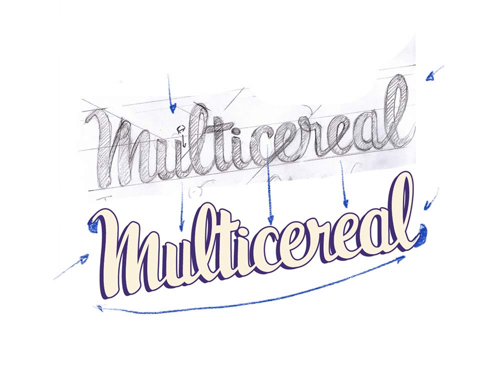
Jenny Mercer solved most of the problems in the hand sketch and continued improving her shapes as she moved on to the digital drawing.
I'll be hosting more sessions in the future, keep your eyes peeled! Have a great weekend.
Martina.

